Selected Branding Case Studies
Selected Branding Case Studies
The Guildhall Salisbury
Salisbury City Council
Roll-out Summer 2021
![]()
Salisbury City Council
Roll-out Summer 2021

In brief.
Create a new visual identity for The Guildhall Salisbury to be used across a range of brand communications, including a newly commissioned website.
The client was looking for an identity that reflects and captures the heritage of the building, and the fine city in which it stands.
![]()
Logomark for ‘The Guildhall Salisbury’
![]() Full logo – white on black
Full logo – white on black
![]() Typography page from brand guide document
Typography page from brand guide document
![]()
Colour page from brand guide document
![]()
![]()
Example brand applications
Development PDF ︎︎︎
The client was looking for an identity that reflects and captures the heritage of the building, and the fine city in which it stands.

Logomark for ‘The Guildhall Salisbury’
 Full logo – white on black
 Typography page from brand guide document
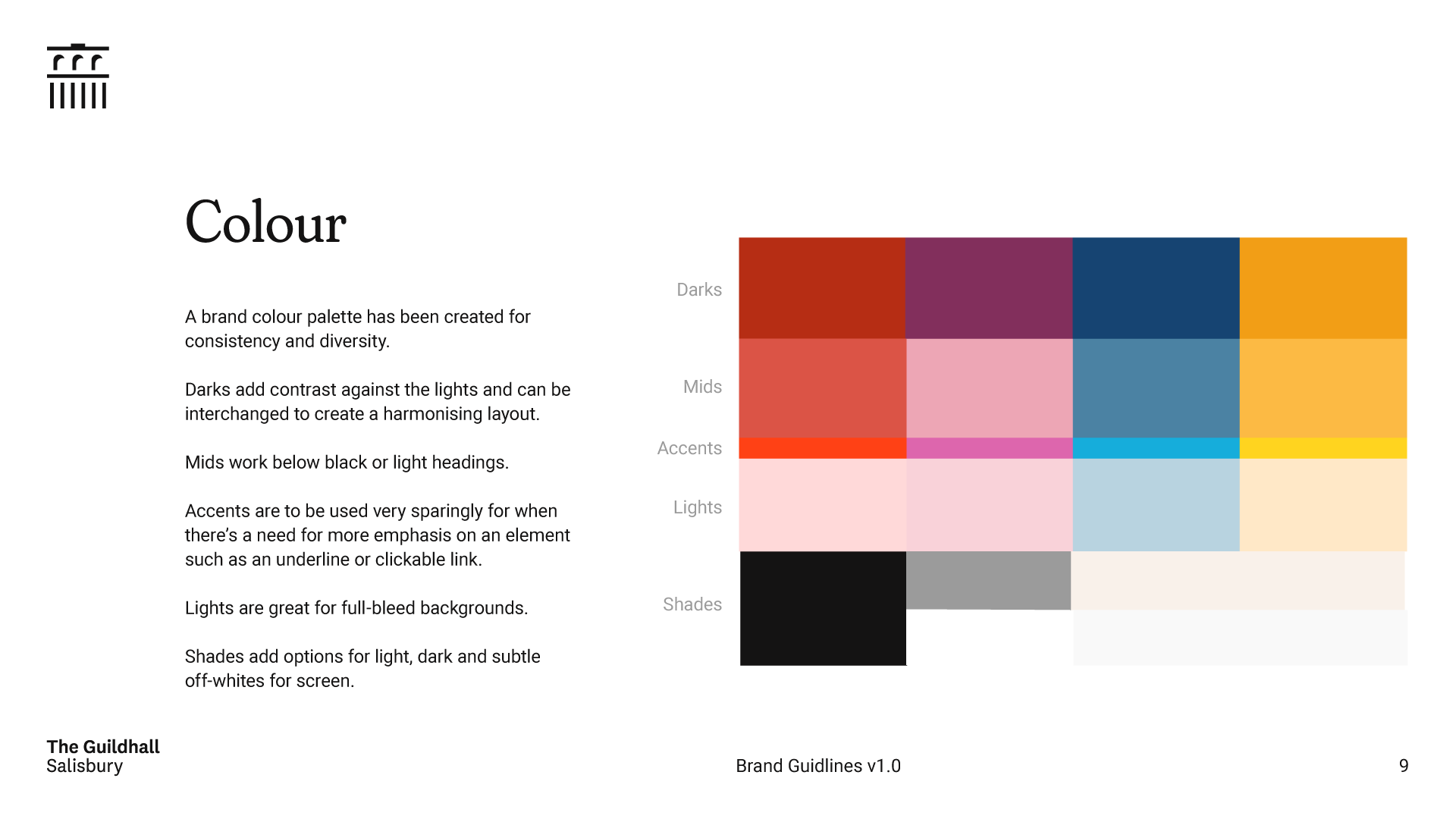
Colour page from brand guide document
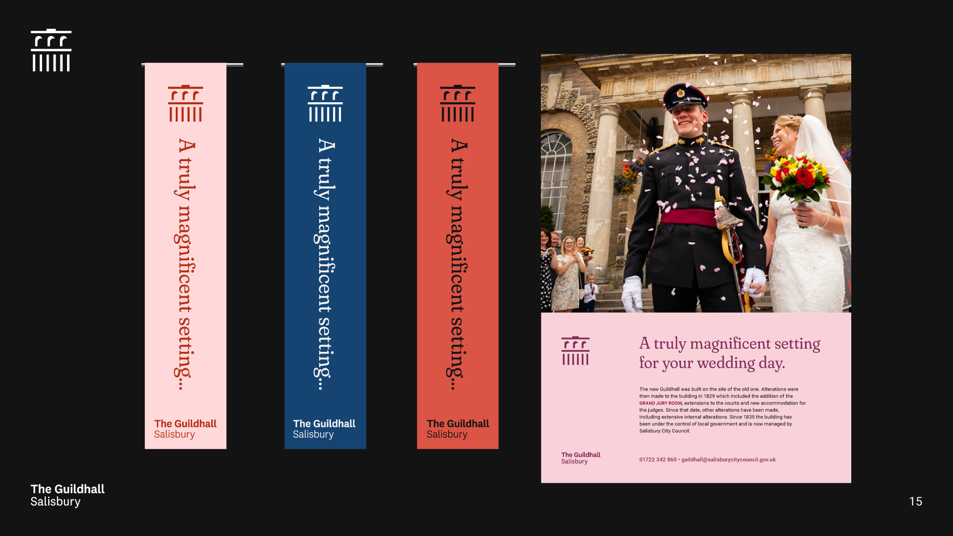
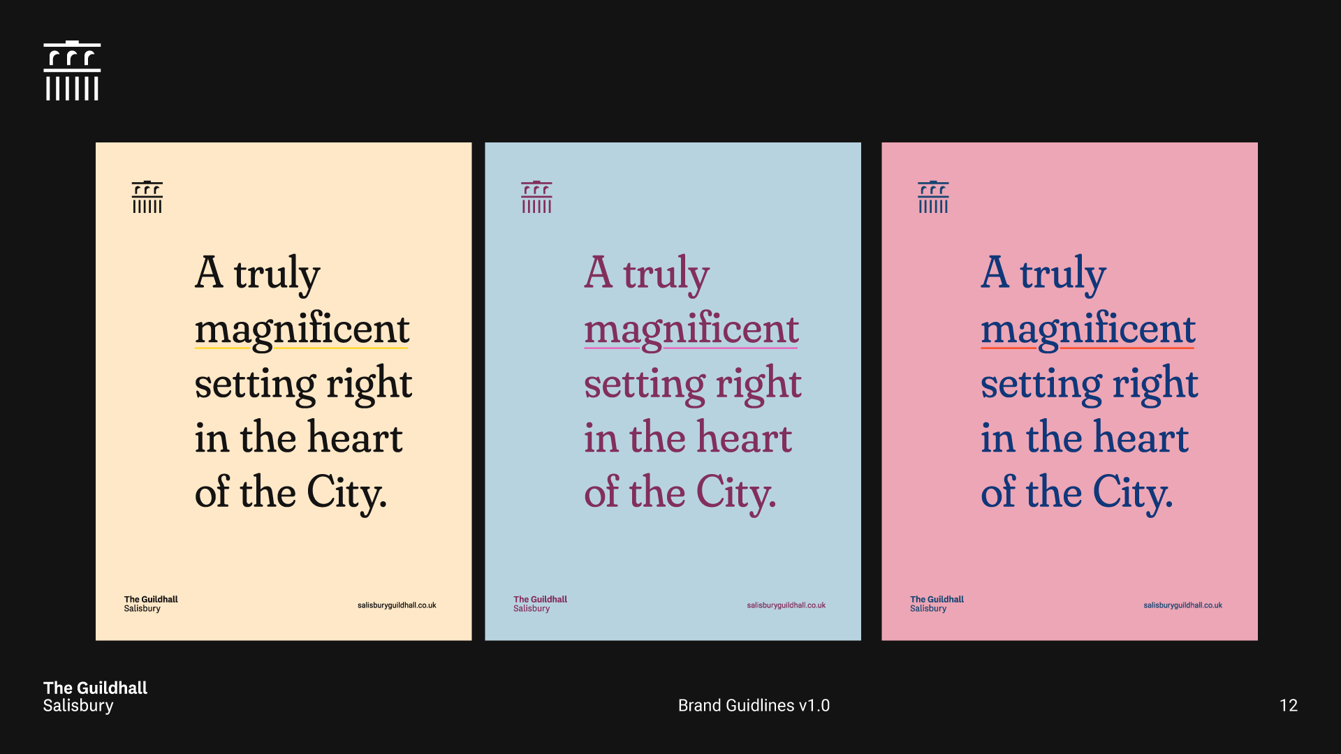
Example brand applications
Development PDF ︎︎︎
Beginners
Animation Studio
2019
Animation Studio
2019
In brief.
Nurturing a seed of an idea into an identity for a new animation studio helping people with something to say, reach a world that wants to listen.
The client had the name ‘Beginners’ and a rough concept of a ‘b’ taking a first step. I helped to form this idea into a bold, approachable visual identity for the studio.
![]()
![]()
I adapted a fitting typeface to work as the logomark for Beginners, opting for all in lowercase to mimic the ‘b’ logomark. The original typeface had deep, narrow ink traps that didn’t translate well when scaled down. The dot of the ‘i’ was changed to a circle to mirror the dot used for the head on the ‘b’ logomark. An angle was cut into the ‘r’ to allow for tighter tracking of the whole wordmark.
![]() Logotype in use on the website
Logotype in use on the website
The client had the name ‘Beginners’ and a rough concept of a ‘b’ taking a first step. I helped to form this idea into a bold, approachable visual identity for the studio.
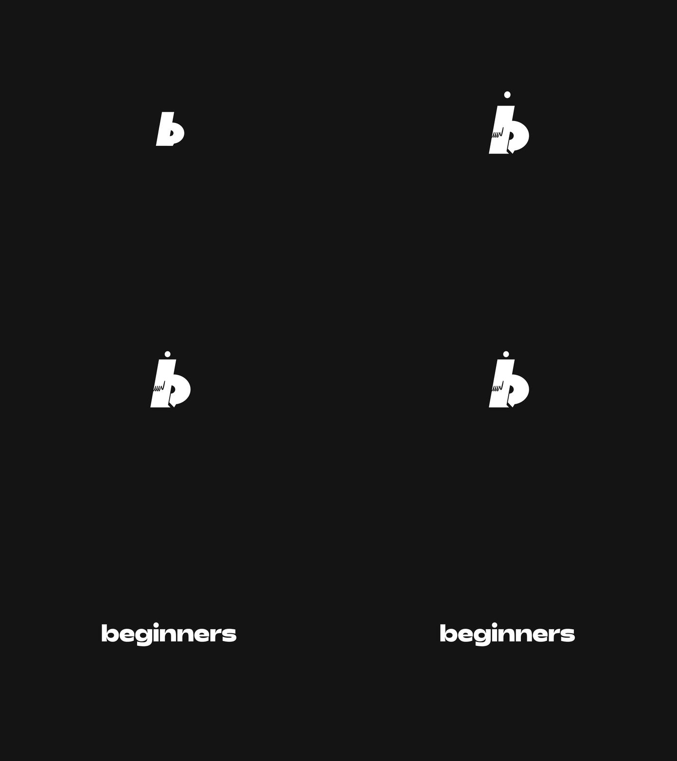
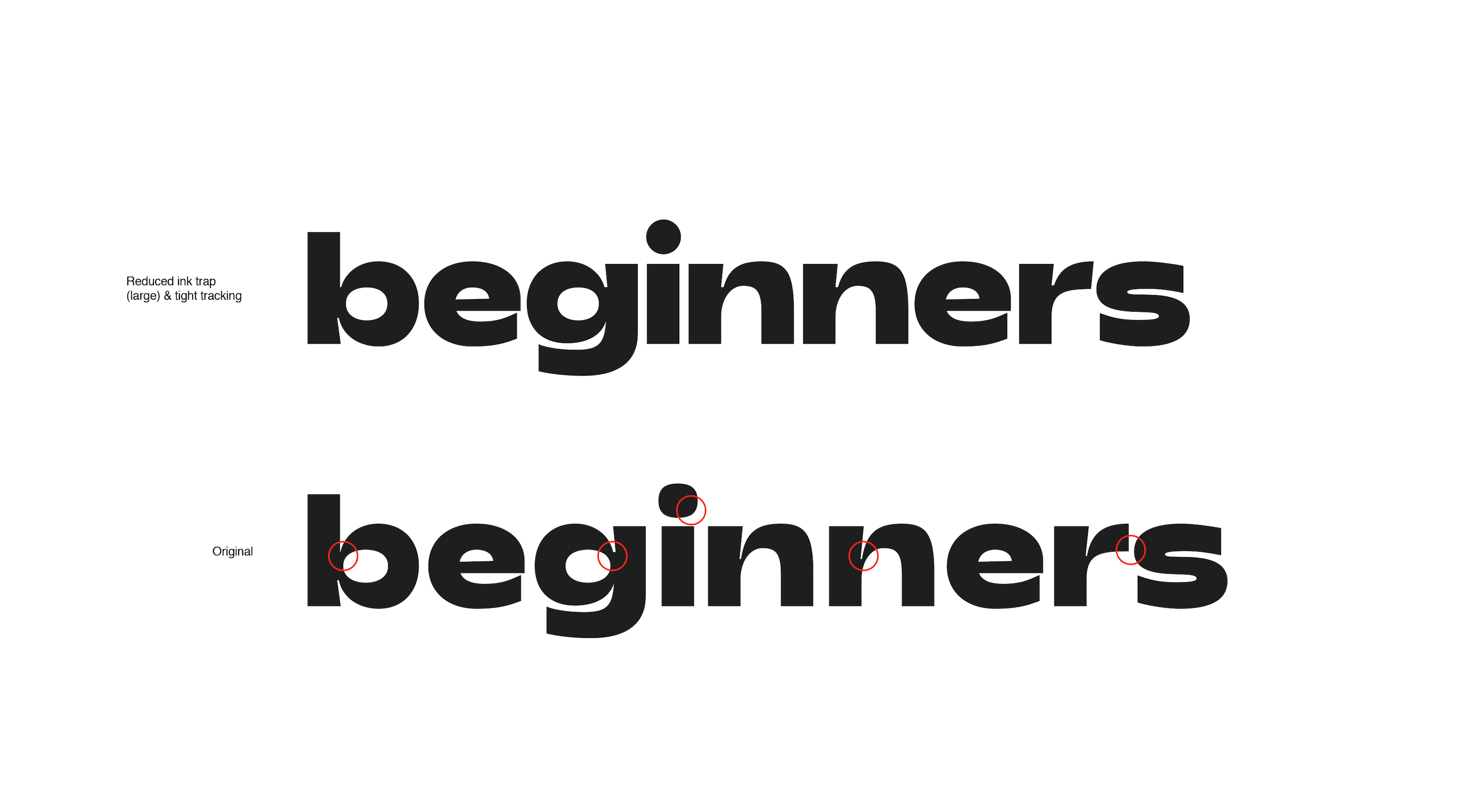
I adapted a fitting typeface to work as the logomark for Beginners, opting for all in lowercase to mimic the ‘b’ logomark. The original typeface had deep, narrow ink traps that didn’t translate well when scaled down. The dot of the ‘i’ was changed to a circle to mirror the dot used for the head on the ‘b’ logomark. An angle was cut into the ‘r’ to allow for tighter tracking of the whole wordmark.
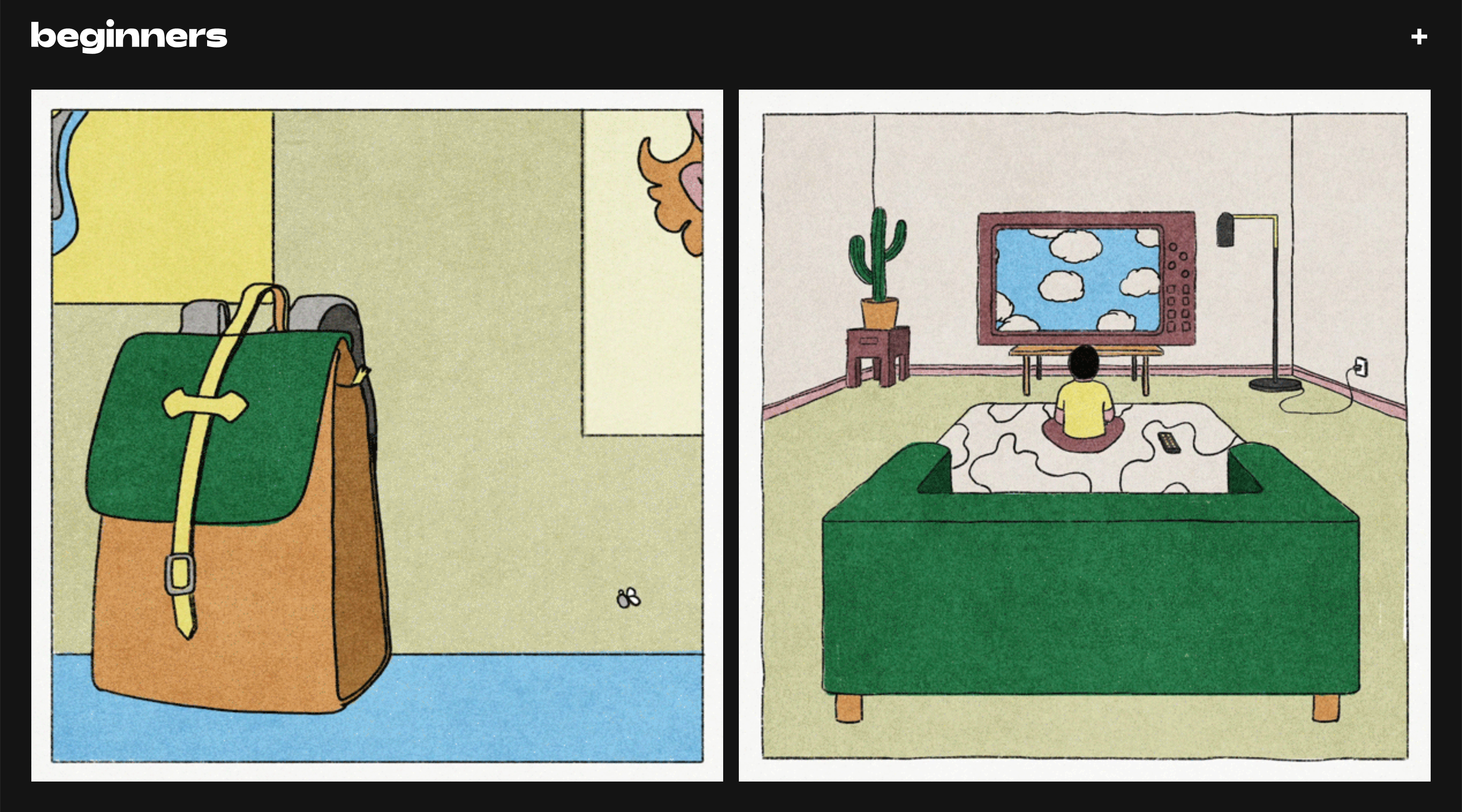 Logotype in use on the website
Robert James Cricket
Local Master Batmaker
2018 –
Local Master Batmaker
2018 –
In brief.
Robert has been handcrafting cricket bats for many years and needed an identity that would allow him to build brand recognition with his customers and grow into producing his own full range of cricket gear. The outcome came in the form of a monogram displaying his initials in the shape of a shield. Combining a traditional silhouette with a contemporary twist, the logo was created to be seen from rage on the field.
![]()
Robert James monogram logo
![]()
Full logo with logotype
![]()
Monogram in use on t-shirt during a workshop event in Pilch Norwich
![]() Robert James bat and gloves in use
Robert James bat and gloves in use
![]()
Bats in progress

Robert James monogram logo

Full logo with logotype
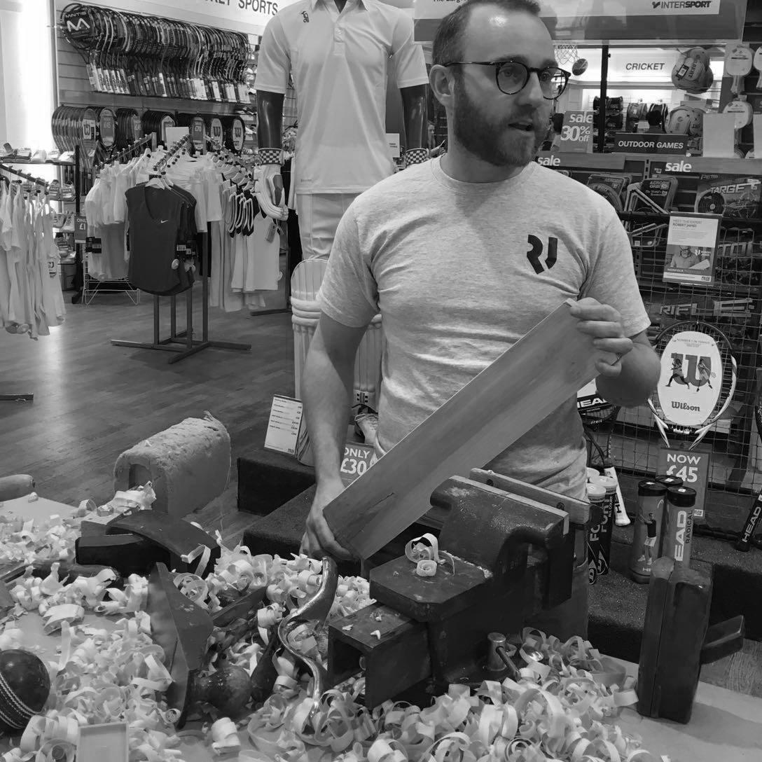
Monogram in use on t-shirt during a workshop event in Pilch Norwich
 Robert James bat and gloves in use
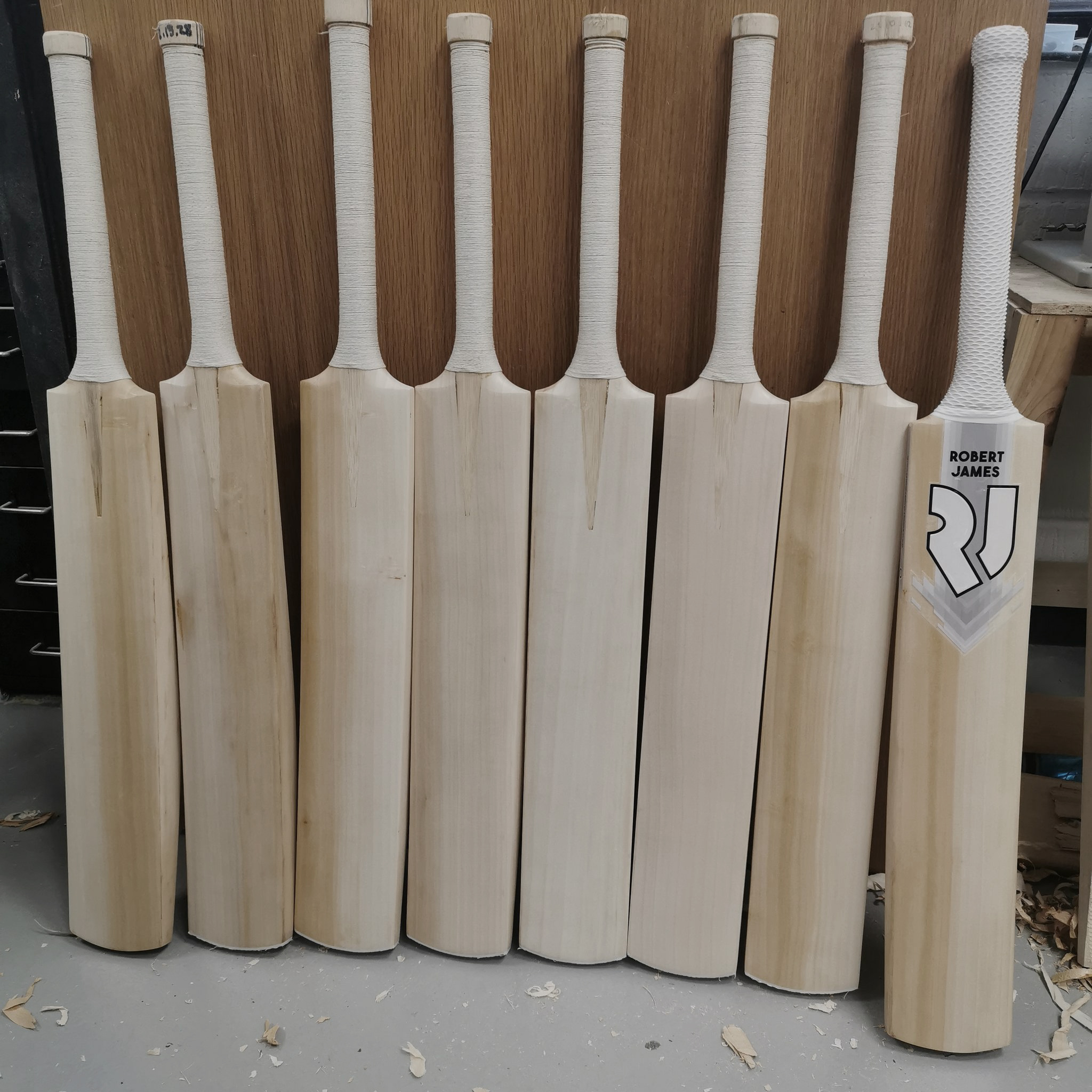
Bats in progress
Norwich Vibes
Video series uncovering the creative scene in the fine city
2020
Video series uncovering the creative scene in the fine city
2020
In brief.
An identity for a new video series exploring the lesser-known cultural scenes of Norwich and beyond. Norwich Vibes invites viewers closer, for a more intimate view of life in the city through the form of interviews with local artists.
Targeting a younger demographic, I decided to focus more on the ‘Vibes’ wordmark and opted not include ‘Norwich’ in the logo itself. This helped to create an edgy, underground tone and editorial feel that would resonate well with the audience, and also allow for future expansion of the series to other cities in the future.
The pulse line-work depicts the City cathedral as well as loosely forming the letters ‘N’ ‘V’.
![]()
![]()
Logo in various colourways
![]()
Simple brand guide
![]()
Norwich Vibes Instagram
Development PDF︎︎︎
Targeting a younger demographic, I decided to focus more on the ‘Vibes’ wordmark and opted not include ‘Norwich’ in the logo itself. This helped to create an edgy, underground tone and editorial feel that would resonate well with the audience, and also allow for future expansion of the series to other cities in the future.
The pulse line-work depicts the City cathedral as well as loosely forming the letters ‘N’ ‘V’.
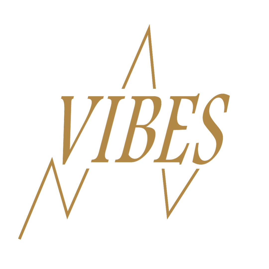

Logo in various colourways
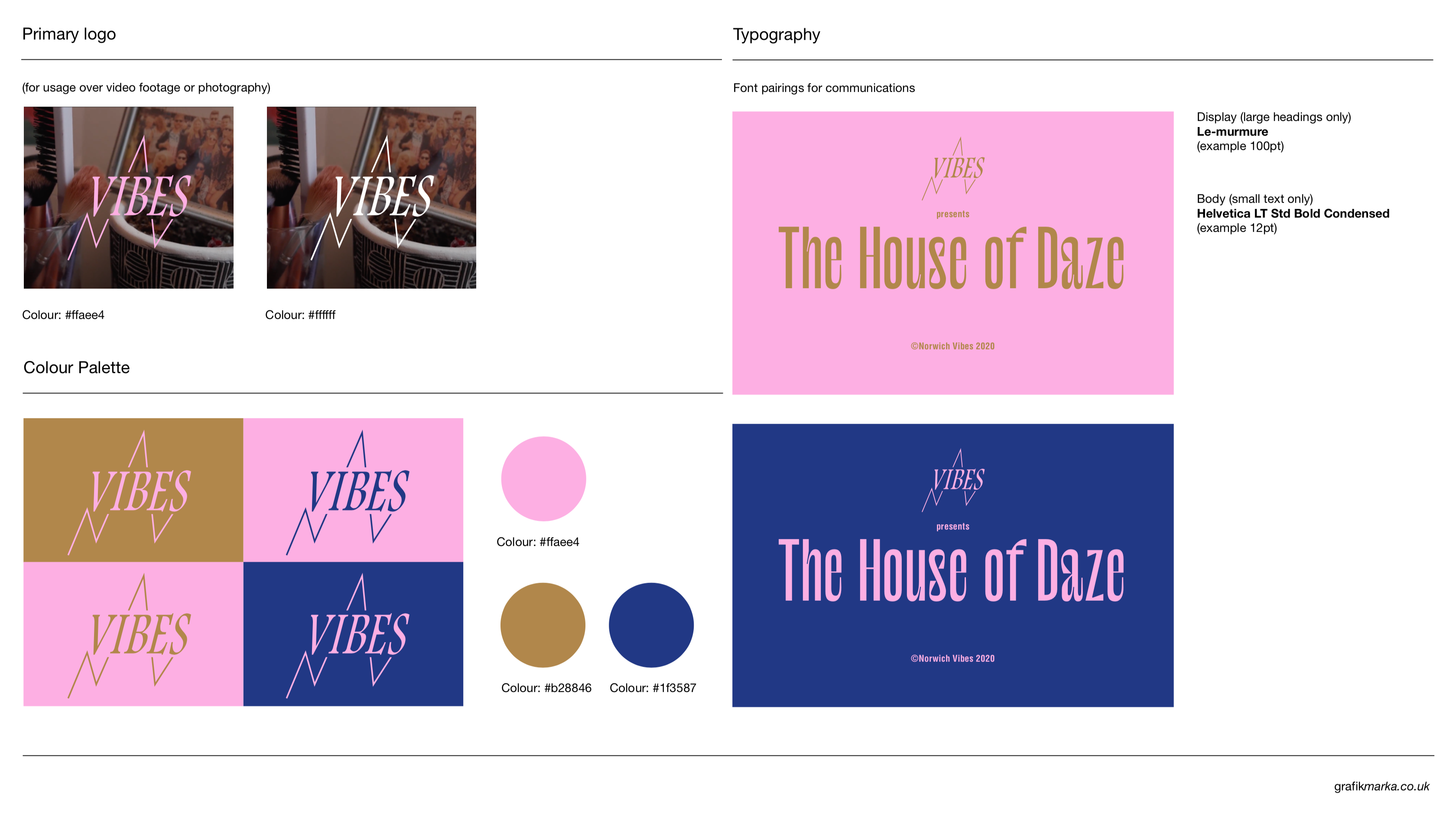
Simple brand guide
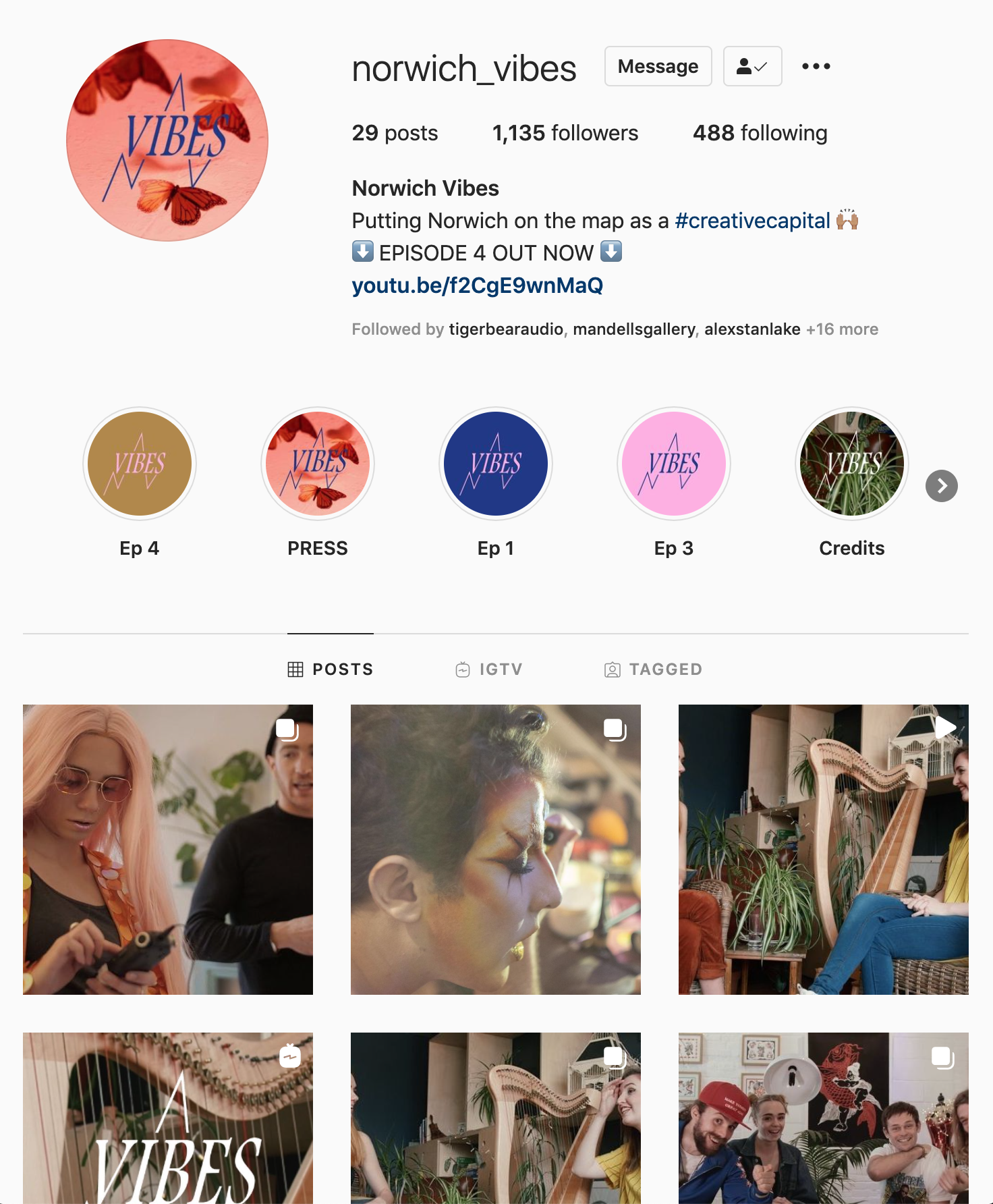
Norwich Vibes Instagram
Development PDF︎︎︎
If you have any questions about my work or the process behind them, please get in touch.
︎ 07955 860058
︎ grafikmarka@mail.com